
Strategy behind the screens
Case studies built around current sites, clarity, and proof.
The homepage gives visitors a fast visual teaser. This page gives the deeper story: what each organization needed, how the experience was shaped, what the current site communicates, and why the work matters.
03
Live sites referenced
06
Current positioning signals
01
Homepage proof system
QA
Proof-first language, no invented metrics
Proof standards for every case study.
Each project is written around observable strategy, current-site signals, design direction, and deliverables. We avoid invented revenue or lead claims unless the client has real data to support them.
What to add later
Client-approved testimonialsBefore/after screenshotsPerformance metrics when availableProject timeline and platform details
Healthcare innovation + AI impact
HCFII Tech
HCFII needed a digital presence that could make a broad healthcare innovation mission feel focused, credible, and immediately legible to leaders, partners, researchers, and operators.
Updated with current hcfii.tech positioning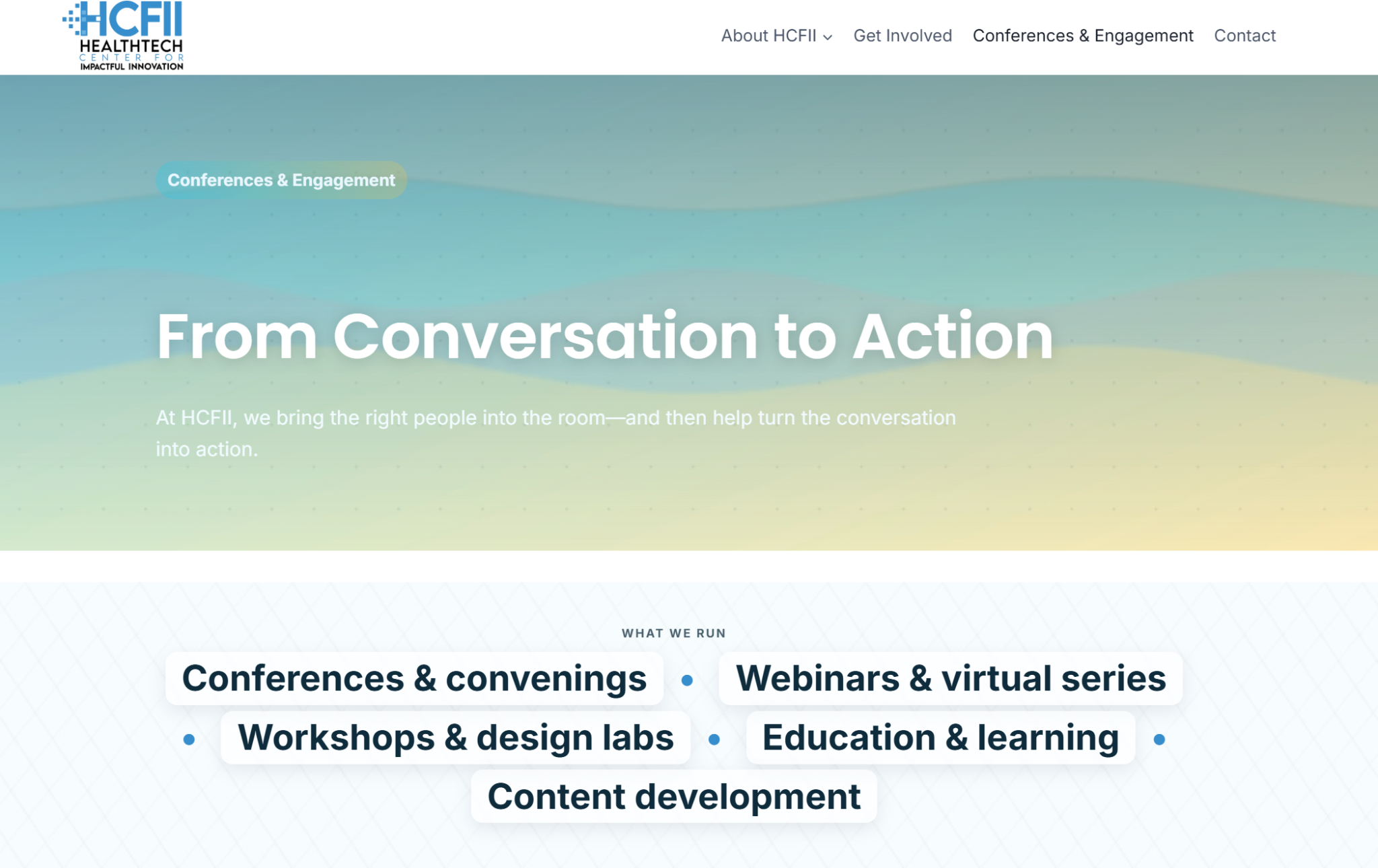
Make a complex innovation platform feel focused without losing the ambition of the organization.
Lead with mission, audience clarity, and specific focus areas so visitors can quickly see where they fit.
Use a clean technology visual system with bright healthcare gradients, spacious hierarchy, and directional messaging.
Website structure, homepage messaging, credibility framing, sector positioning, and a scalable content foundation.
Clearer positioningInnovation story simplified without flattening the vision.
Scalable structureBuilt to support programs, focus areas, partners, and future content.
Trust-forward presenceMore polished first impression for healthcare and technology audiences.
Healthcare + community trust
Falls City Medical Society
Falls City Medical Society needed a site that could honor a long institutional legacy while making its modern mission, impact programs, membership pathways, and community role easier to understand.
Updated with current fallscitymedicalsociety.com content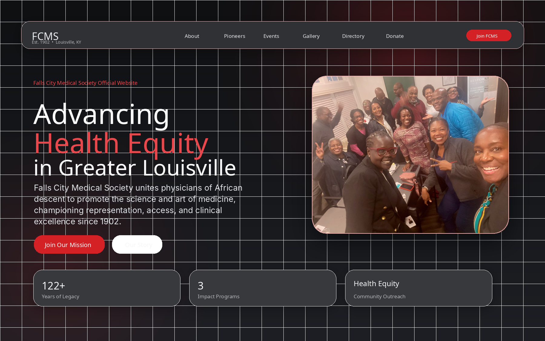
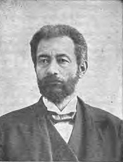 Legacy storytelling layer
Balance institutional history with modern usability, membership needs, community engagement, and credibility.
Turn the site into a clearer digital front door with stronger sections for mission, membership, leadership, and action.
Use a polished healthcare/community system with strong contrast, historical gravitas, and clearer hierarchy.
Website redesign direction, page architecture, content organization, portfolio-ready narrative, and launch guidance.
Mission-led storytellingLegacy and community impact become more central to the experience.
Better page architectureVisitors can navigate membership, leadership, events, and contact paths more naturally.
Credibility through historyThe organization’s past becomes a trust asset, not hidden context.
Physician-led education + patient clarity
StephMed
StephMed needed a warm, credible physician brand presence that connects family medicine, patient education, speaking opportunities, prevention, and a more human health message.
Updated with current stephmed.com content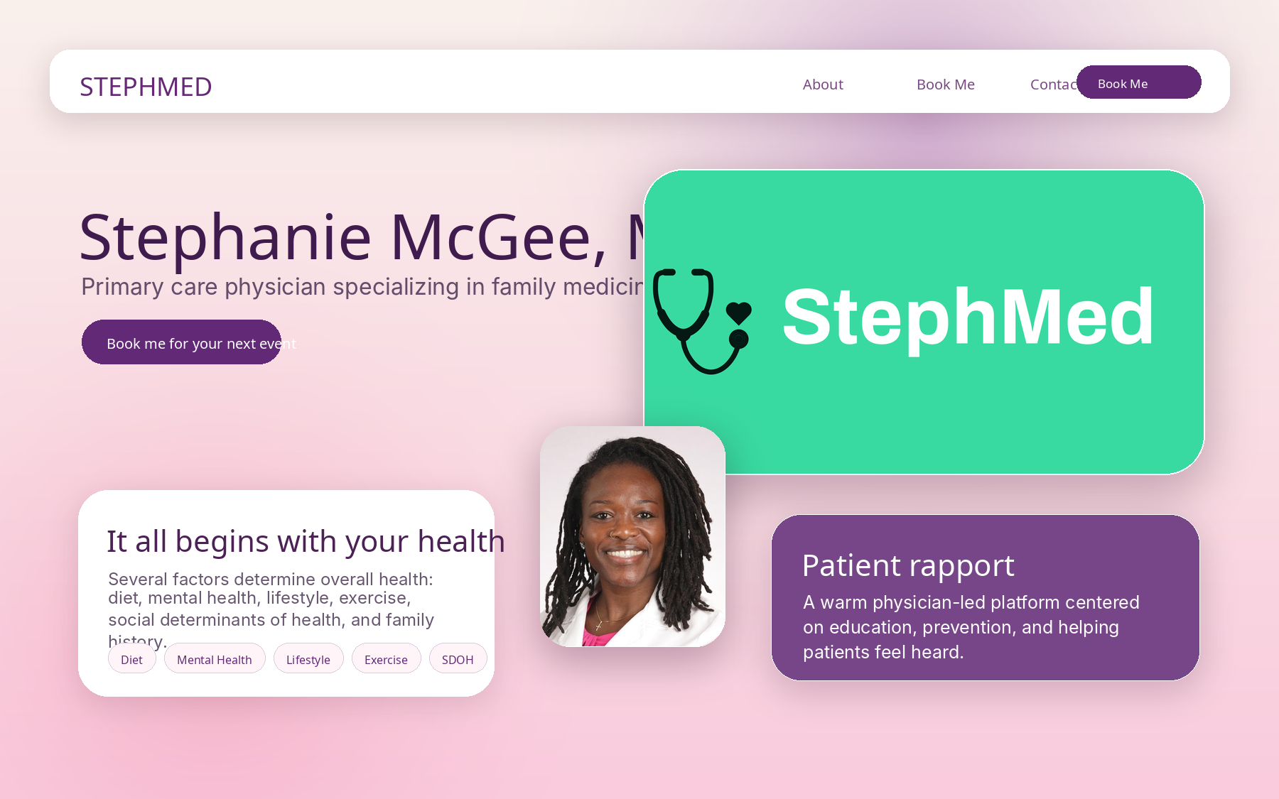
Create a personal healthcare brand that feels warm and approachable while still preserving clinical credibility.
Center the experience around the physician’s role, health education, patient empowerment, and a clear booking pathway.
Use a fresh, welcoming visual language with bright brand color, personal imagery, and simple messaging.
Brand presence, website structure, speaker-friendly call to action, visual direction, and patient-friendly content framing.
Warmer physician brandThe site feels human and educational, not cold or corporate.
Clear booking pathSpeaking and contact actions are easier to notice and understand.
Patient-friendly educationHealth information is framed around understanding, confidence, and trust.
Want a case study like this?
Let’s start with your website & Google presence review.
We’ll identify the highest-impact improvements for your website, trust signals, portfolio proof, and conversion path.